{ Case Study }
Kijiji Safety Design
During the pandemic, my colleagues, Mike Kelly, Eugene Pokrovsky, and I challenged ourselves with completing a remote hackathon style group challenge. We chose Online Marketplaces as our problem area and began brainstorming and researching potential problem spaces within the area.
{ Define }
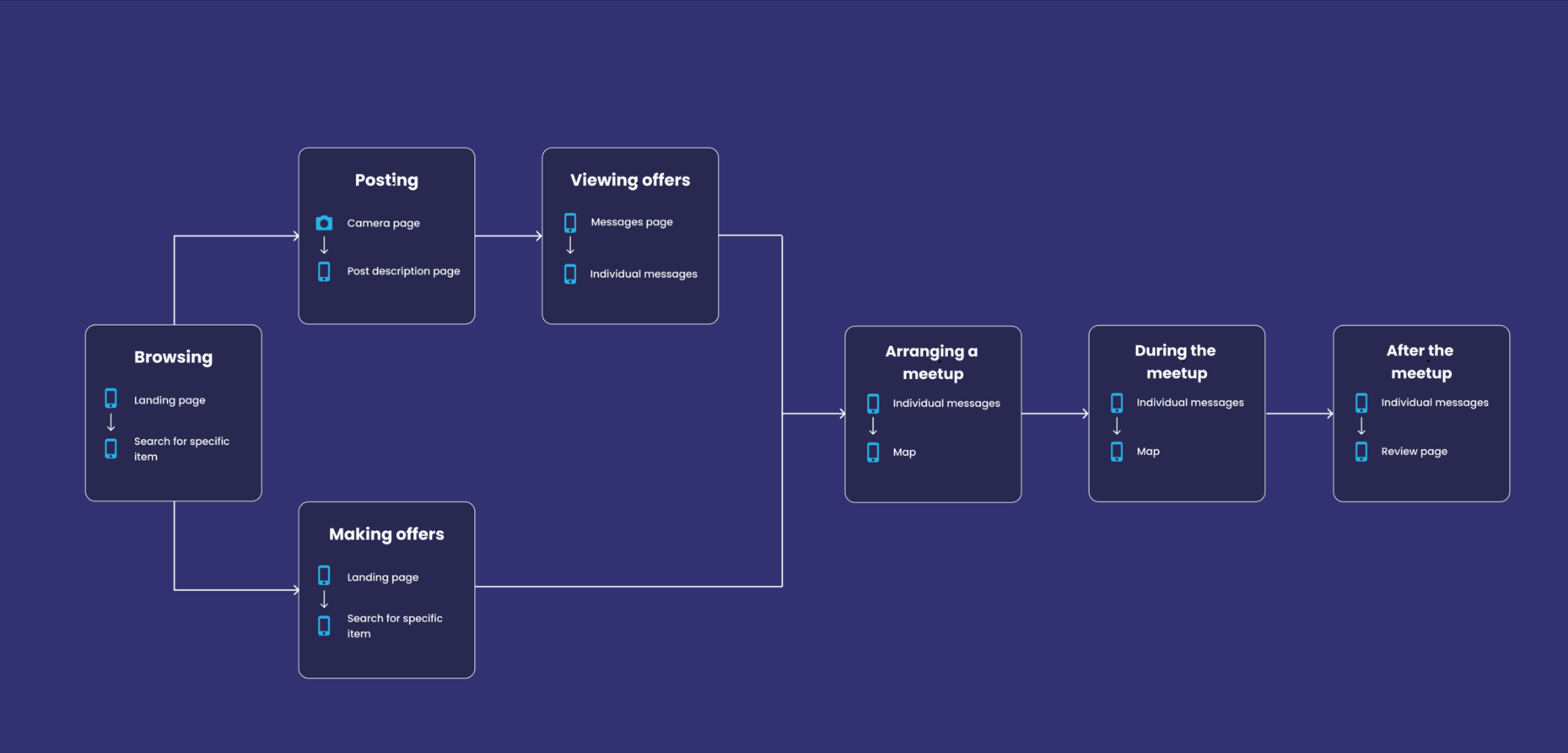
The Problem
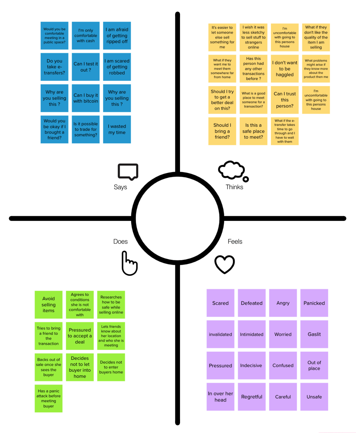
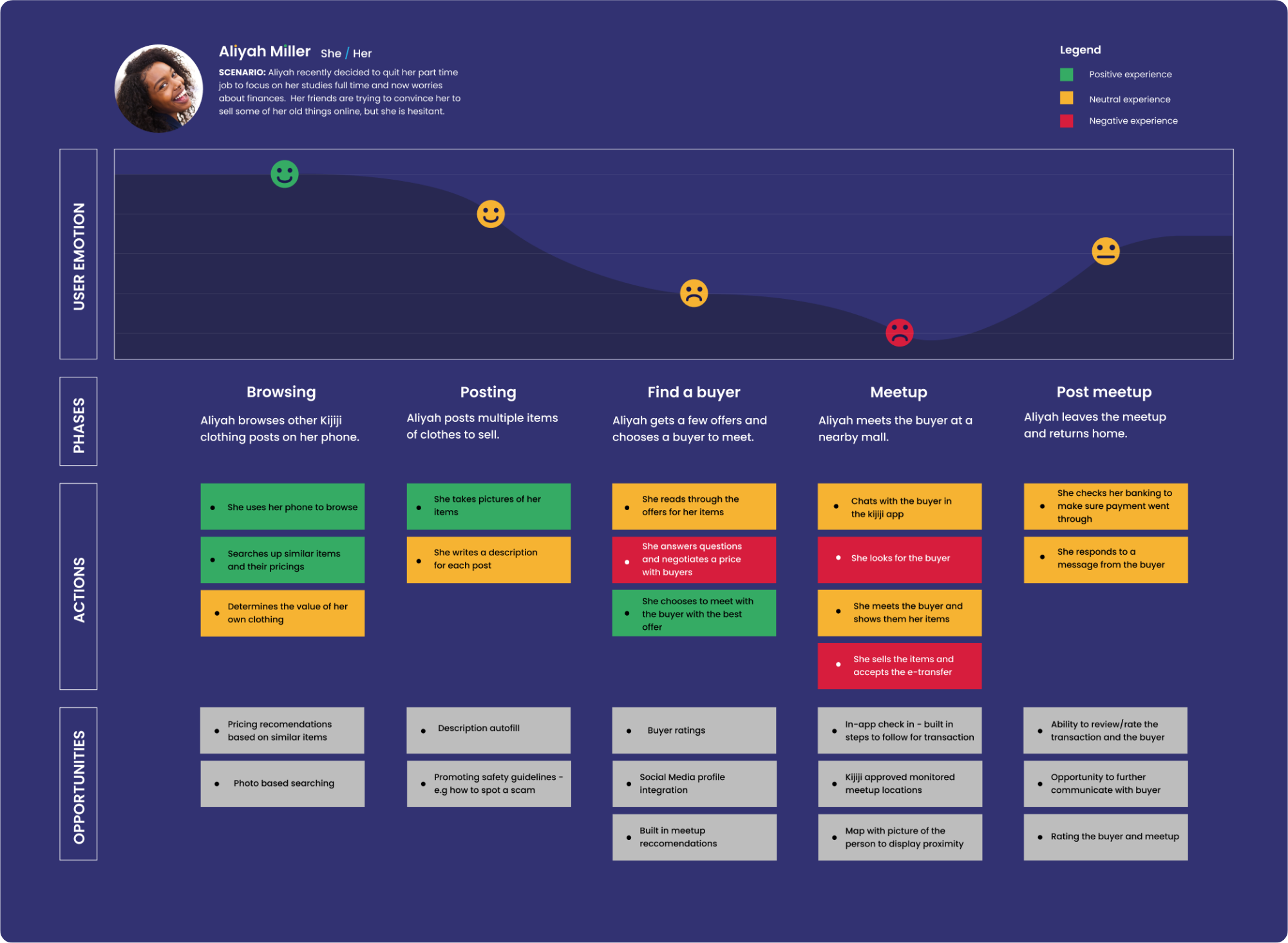
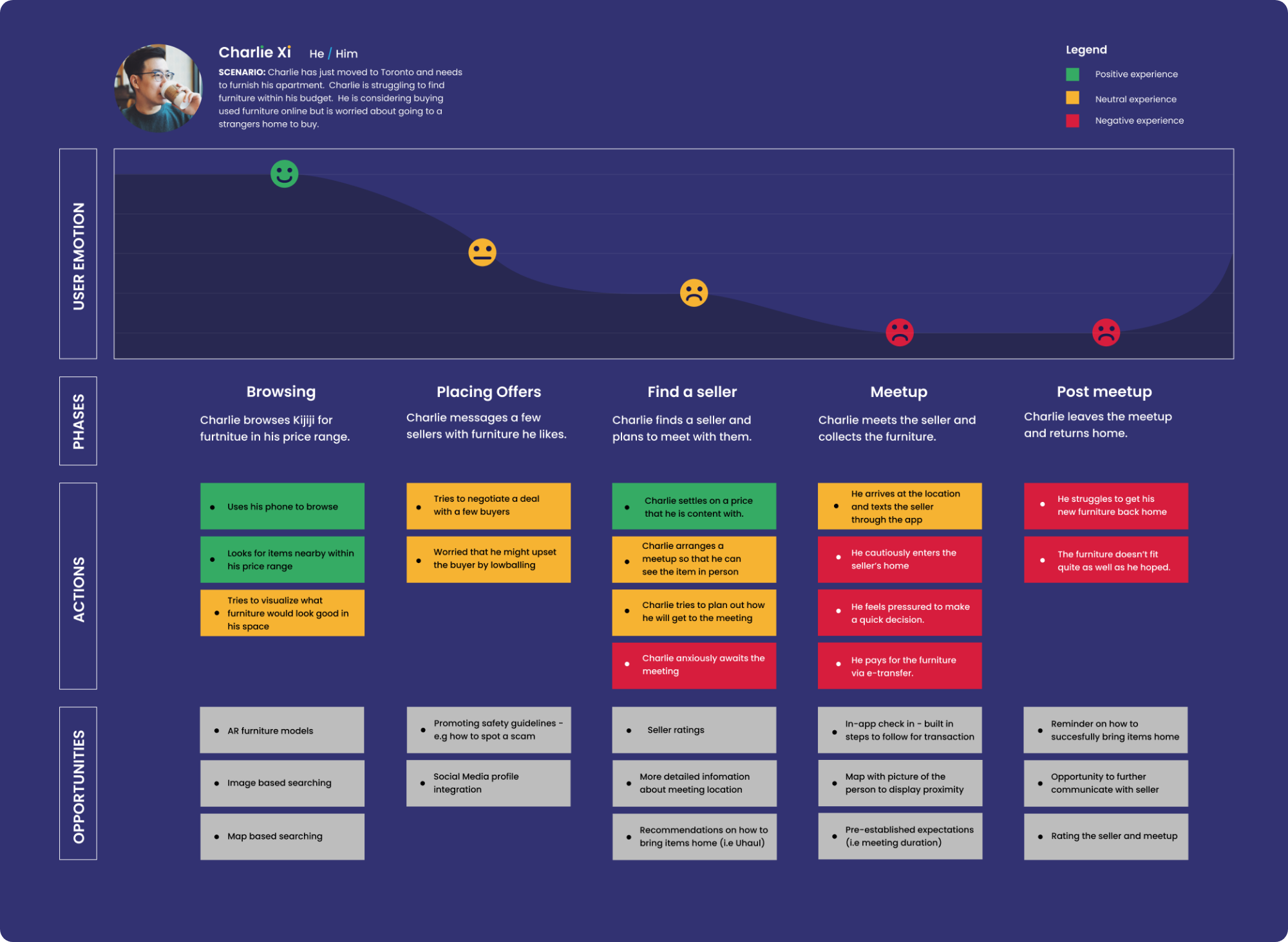
A large group of Kijiji users aged 24 and under are reluctant to use the platform for buying and selling because they feel intimidated by the meetup experience.
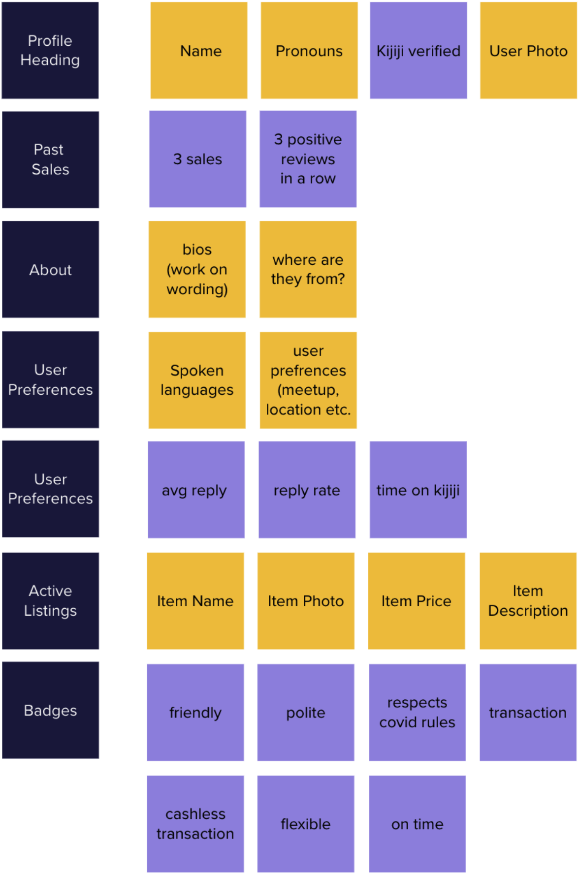
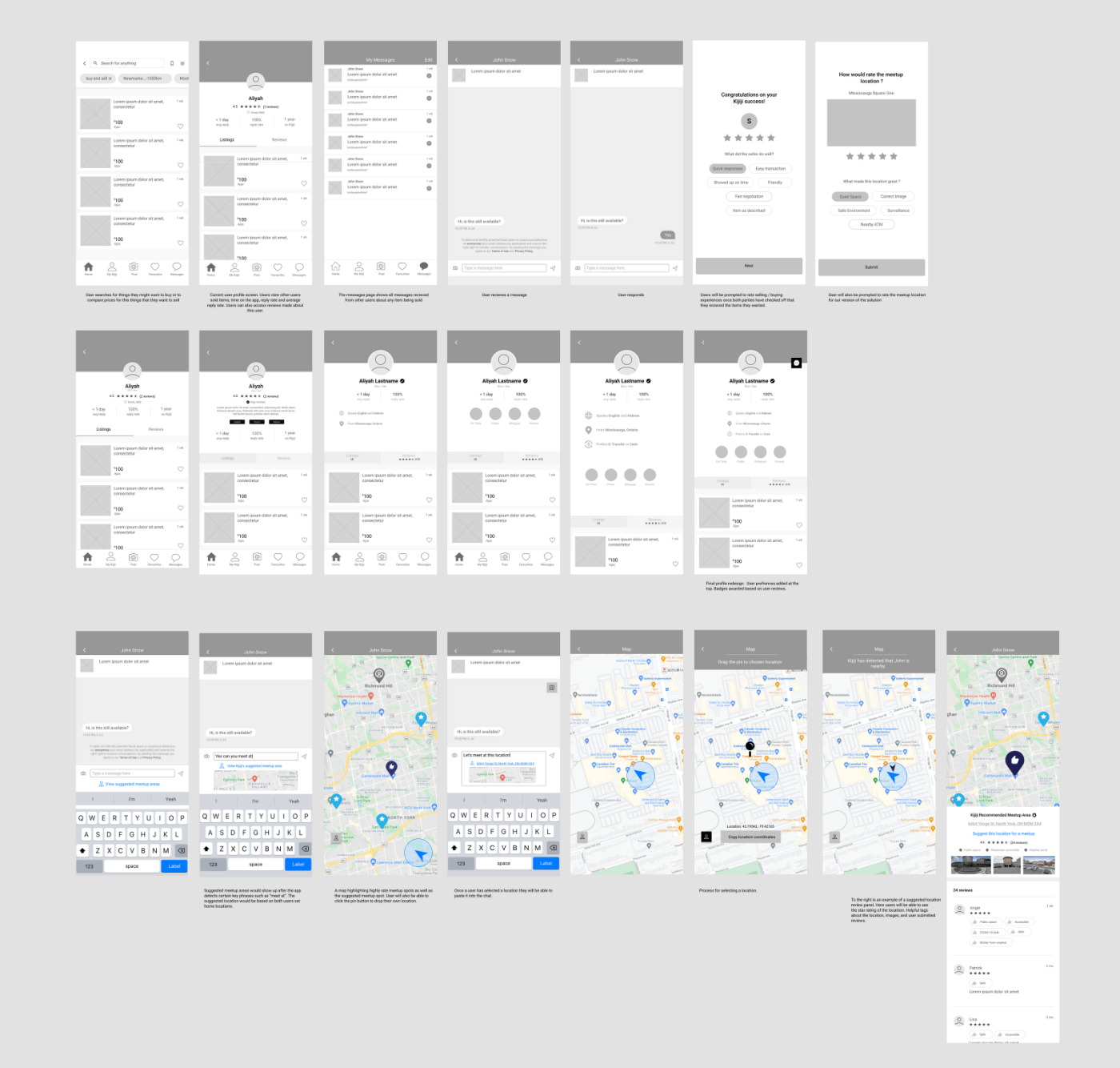
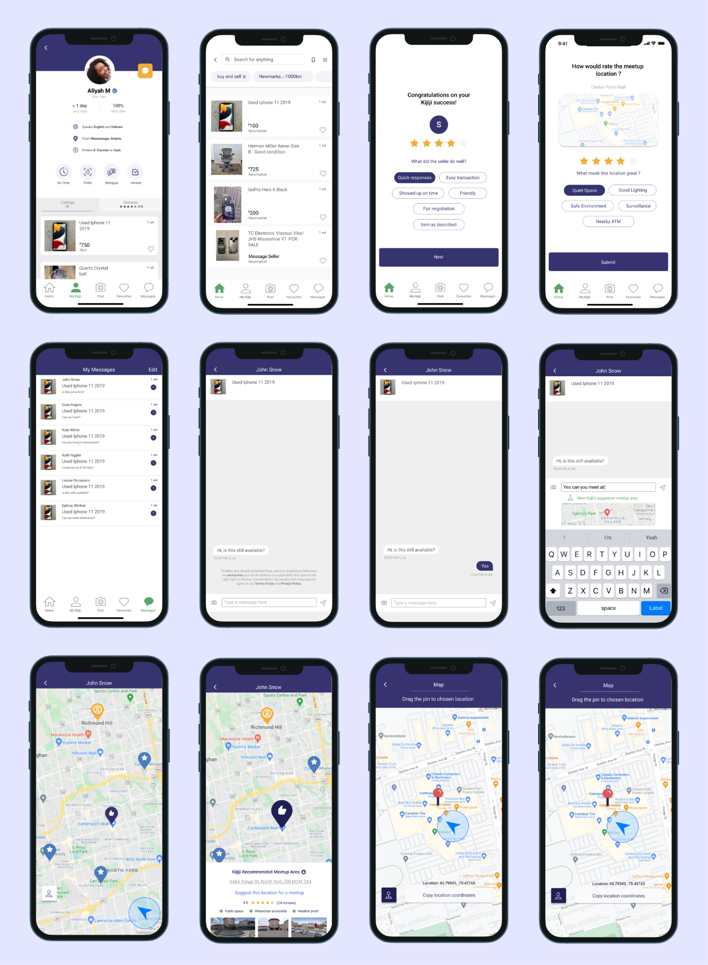
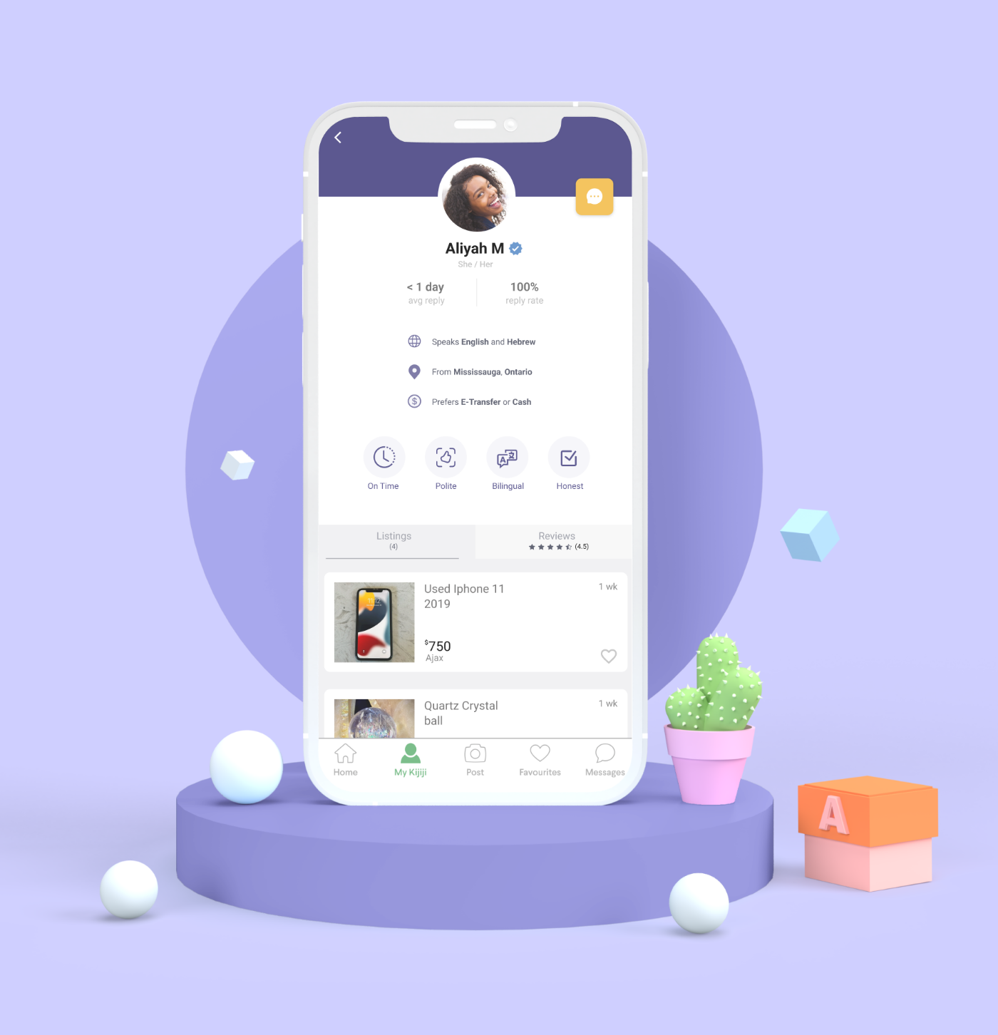
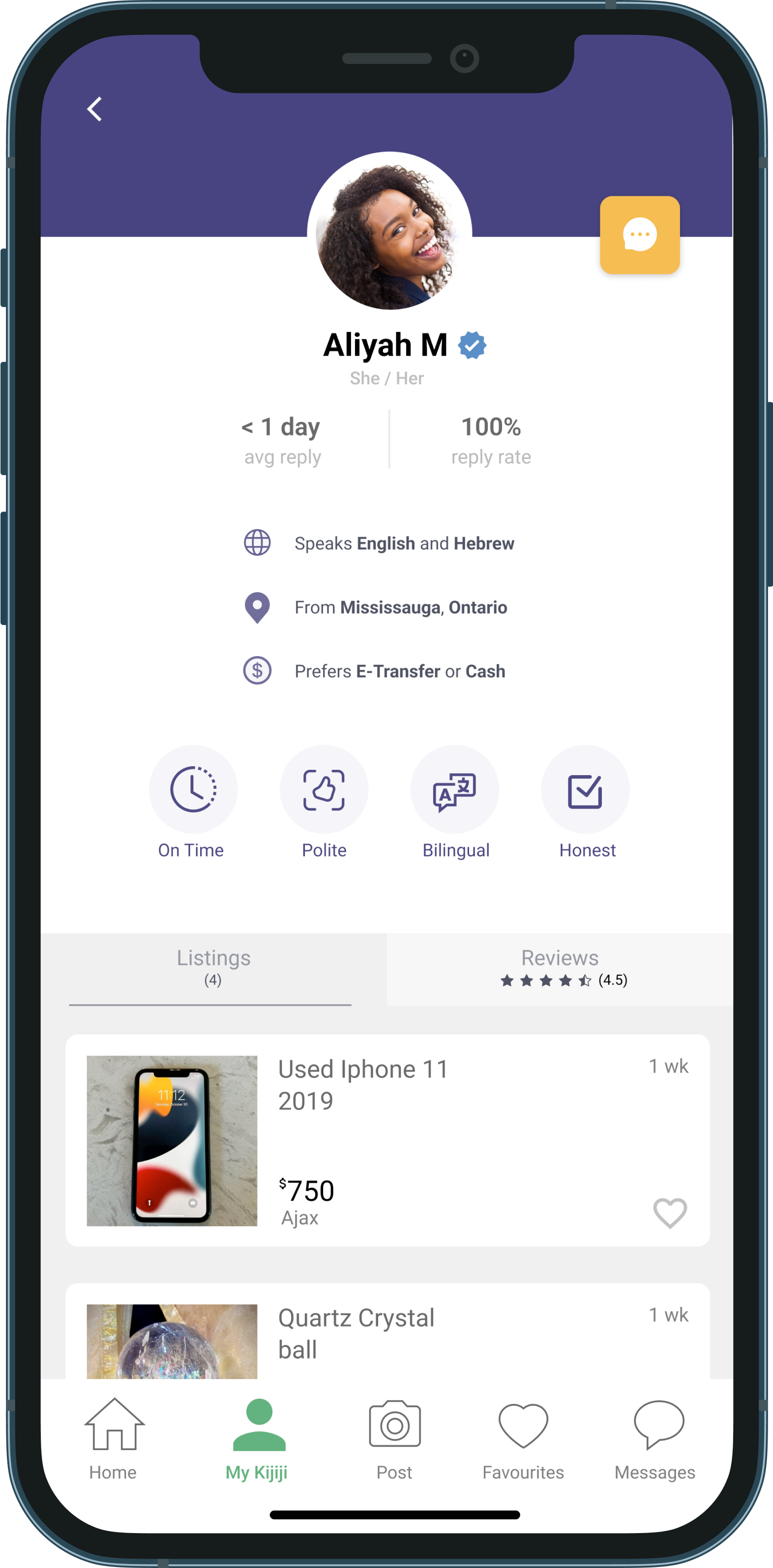
In-Depth User Profiles
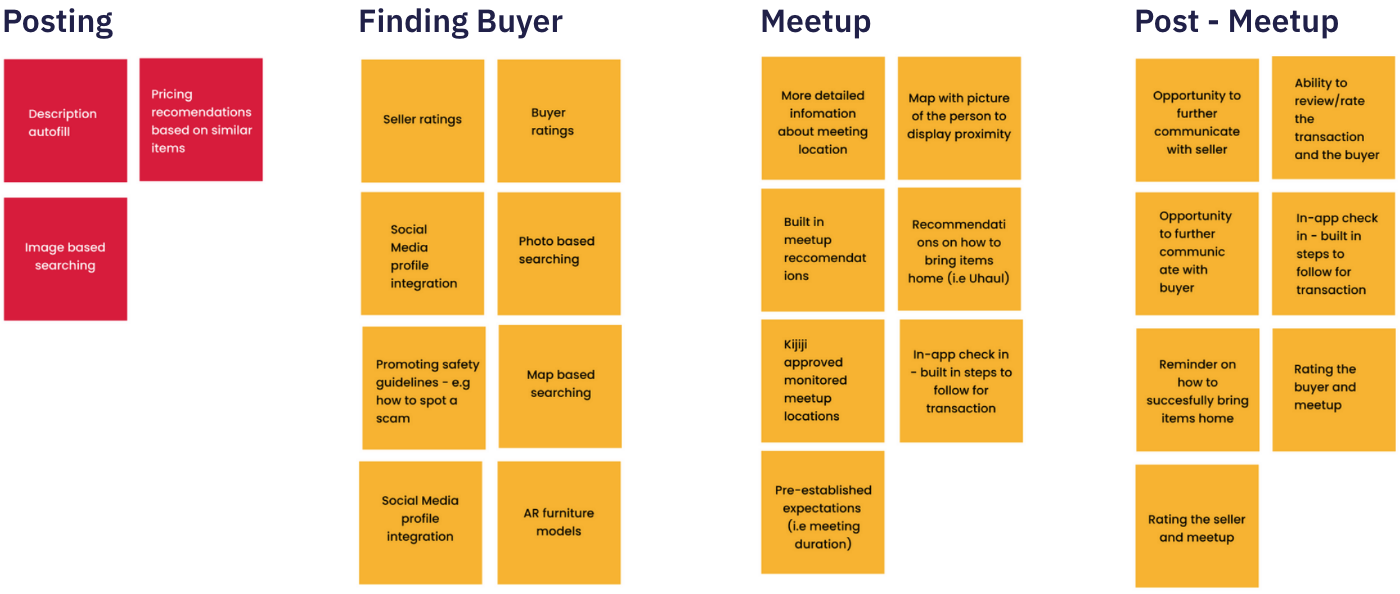
Reduce Meetup Anxiety
Learn more about the person you are meeting. Adding more in depth user profiles that highlight spoken languages, pronouns, transaction preferences and more to reduce meetup anxiety and save users chat time.
User Benefits Sought:
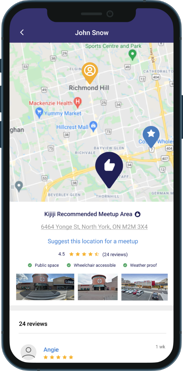
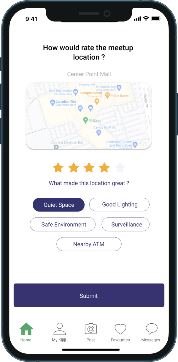
Location Verification
Prioritize Safe Meetups
Users help to verify, rate, and recommend select meetup locations highlighting accessibility, safety, and nearby amenities.
User Benefits Sought:
Meetup Suggestion
Save Users Time
Generated meetup recommendations based on specific user needs and location. Integrated with the chat feature, locations in between users are suggested.
User Benefits Sought: