Overview
Amuse is a location-based storytelling app that turns the world around you into an interactive museum, unlocking fun facts, trivia, videos, and audio stories about the places you're standing near. I joined as employee #5 and the company's first designer, with a product that had no visual identity, no design system, and screens that needed a complete overhaul.
Over three years I owned the end-to-end design of the consumer app across iOS, Android, and mobile web, building two design systems, defining the core interaction model, advocating for new features, and shipping continuously alongside a small engineering team.
Starting from zero
When I joined Amuse, the app existed, but barely. There was no visual brand, no component library, no documented interaction patterns. Screens had been built feature-by-feature without a coherent system underneath them. My first task was to figure out what Amuse should look and feel like before we could build anything worth keeping.
From the start, my Product Lead and I made talking to real users a priority. We ran structured interviews and recruited strangers for guerrilla testing sessions, watching real people interact with early builds, asking what they were looking for, and listening for the gaps between what they said and what they did. That combination of direct feedback and competitive analysis gave us a clear north star: people didn't want another information app. They wanted to feel the excitement of discovery.
With that philosophy in place, I ran a moodboarding exercise with the team: three distinct visual directions, each with its own personality, to force an honest conversation about what Amuse should feel like before anyone touched Figma.

Direction 1: Clean & Playful. Blues/greens, flat illustration, stamp collection.

Direction 2: Modern Dark. 3D illustration, gradient, purple/blues.
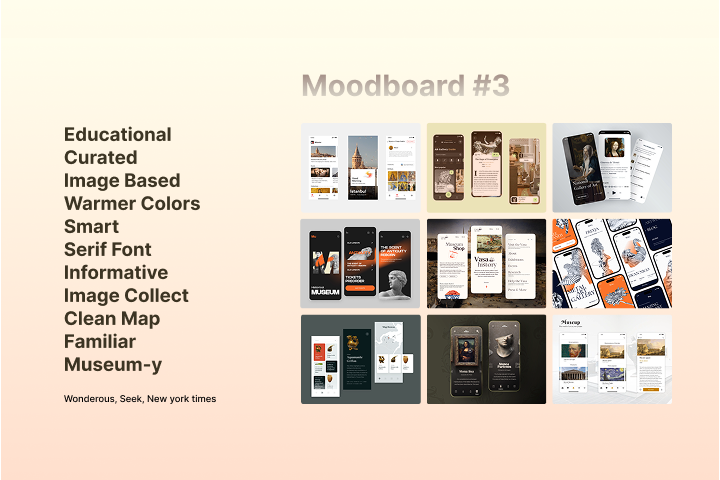
Direction 3: Educational & Curated. Warmer colors, serif font, museum-y.
First explorations
Direction locked, I moved fast: rough screens, quick concept tests, throwing ideas at the wall before committing to anything. The goal was to get a feel for how the visual language translated into actual product surfaces.
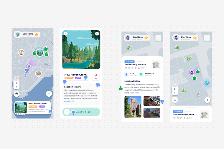
First-week explorations: light themes, colorful pins, and location card patterns.

Pushing toward the dark direction, concept variants before the system locked.

A few weeks in, the dark theme, map system, and content hierarchy starting to take shape.
Building the design system
Before I could design features, I needed a foundation. I built Amuse's design system
from scratch, defining the color language (a deep dark base with the signature
teal #5BF5FF accent), accessible typography using Outfit across all
weights, a complete icon set, and a component library that could scale with a fast-moving
startup.
The system was built in Figma with engineering handoff in mind: every component documented with states, variants, and usage notes. This became the shared language between design and engineering, cutting spec friction significantly.

Brand identity: logo lockups across gradients, backgrounds, and platform contexts.
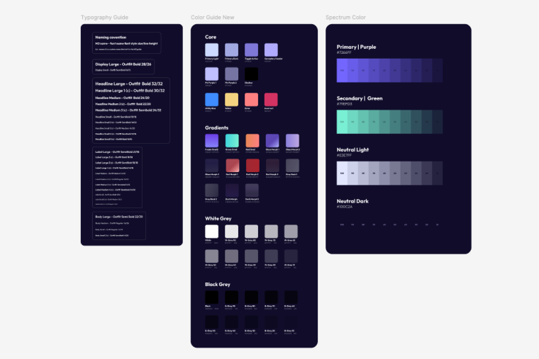
Color and type system: Outfit across all weights, full color palette, and spectrum guide.

The complete component library: every pattern, variant, and state across the full product.
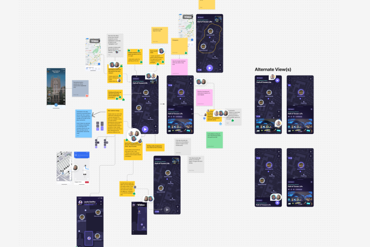
The story player
The story player is the core of the Amuse experience, the screen users spend most of their time in. I designed it as an evolving system rather than a fixed screen, starting with Fun Facts and Video stories and expanding over time as we discovered new user needs and partner requirements.
Each story type presented its own design challenge: Trivia needed clear right/wrong feedback states that felt rewarding, not punitive. Audio stories needed a player interface that worked without visual content. Spotlights needed to annotate dense exhibit imagery with hotspots. The gesture model (swipe up/down for next story set, tap for next story, long press to reveal background) had to be learnable without a tutorial.

Early story variant explorations: Video, Fun Fact, and Trivia sharing a common structure before the visual system existed.
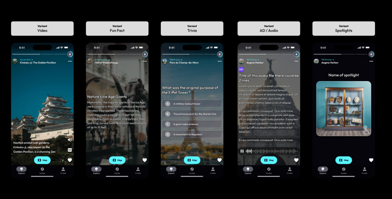
The shipped story player: Audio, Fun Fact, Trivia, and Spotlight all unified under the same interaction model.
Key decision
I pushed for gamification early, specifically the Trivia story type. The hypothesis was that interactive stories would increase time-in-app and return visits more than passive content. We validated this through user testing sessions at museum partner sites, where Trivia consistently generated the strongest engagement reactions.
Accessibility & inclusion
Audio Description started as a widget tucked inside the info card, an easy workaround, but the wrong answer. It separated AD content from the core experience rather than making it part of it. We moved it into the story player itself so that visually impaired users would experience the same flow as everyone else, just with narrated descriptions instead of visual content.
Once we recognized the real user need, we went to the source. My Product Lead ran structured interviews with visually impaired users, not hypotheticals, but real people navigating the real app, and gathered direct feedback on what worked and what didn't. We took that input and built proper spec around it: a dedicated AD story type, an AD badge for easy identification, narration controls, and a Settings toggle that lets users prioritize AD content in their feed so it surfaces first.
Beyond Audio Description, I kept accessibility as a standing constraint throughout the whole product. The app was audited by an accessibility specialist, and I consistently maintained WCAG-aligned contrast ratios, ensured all text was scalable without breaking layouts, and kept tap targets and interactions straightforward enough to work without fine motor precision.
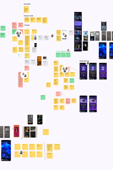
Early brainstorming, mapping out purpose, goals, and concepts before any UI work began.

The shipped AD story type, with the AD badge, narration controls, and full audio playback built into the story player.
Research & iteration
Once the foundation was in place, the work shifted from building everything from scratch to shaping what came next. With a real user base and product data to pull from, the questions got more interesting and so did the process.
Research became a consistent part of the rhythm. My product lead ran a steady program of user sessions: in-person walkalong sessions at partner museum sites, remote interviews, competitor analysis, and focus groups. I was brought in throughout as the design voice, helping translate what we heard into real product direction. That often meant working through the problem space together before anyone touched Figma: a shared FigJam board covered in sticky notes, a collaborative doc mapping out priorities, or a longer structured workshop with the wider team during one of our in-person meetups.
Having a product lead who took research seriously made a real difference. Decisions were grounded in actual behavior, not assumptions. My role was to show up with an opinion, push back when something didn't hold up visually or interactively, and make sure the design perspective was present from the earliest stage of any initiative.

What didn't work
Not everything shipped. Some of the most valuable design work I did at Amuse was recognizing when to stop. A few experiments that didn't survive:
Supersized map icons
We tried large, expanded icons that appeared when a user tapped a map pin, the idea was to surface more context without opening a full card. In testing, users found themselves tapping too many times to get anywhere. We scrapped it for a quick-tap model that opens the story player directly.
The Smart Guide button
A prominent map button that used an algorithm to surface a story relevant to your location. It failed because it didn't work reliably enough: users got confused when it surfaced irrelevant content. The concept survived though: smart story navigation is now built into the story player itself as a swipe gesture.
City Switcher
A feature that let users manually select their city to filter content. We built it and then realized we'd put user burden where automation belongs. Amuse now handles city detection automatically. The lesson: don't make users do what the product should do for them.
Outcome & reflection
Amuse shipped. Real people use it in real museums. We onboarded cultural institution partners including the Yale Peabody Museum, running user tests on-site and iterating the product based on how actual visitors moved through the space. The design system I built has scaled through multiple major feature launches without needing a full rebuild.
Three years as the sole designer at an early-stage startup taught me things that no amount of senior roles at larger companies could have: how to make consequential decisions with incomplete information, how to advocate for design quality when speed is the priority, and how to tell the difference between a feature worth building and one worth killing. Beyond product, the role stretched into museum signage, QR code displays, and marketing design across social, print, and web, the full range of what being a solo designer at a startup actually means.

Amuse as it ships today, a complete product design system across iOS, Android, and web.
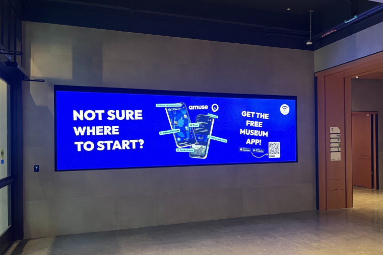
Live in the wild — advertising displayed at our partner museum, the Yale Peabody.
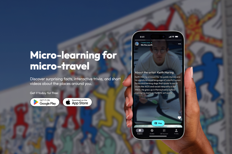
Amuse shipped and available to download on the App Store.